Flywheel is a competitive cycling studio that provides real-time feedback on individual performance.
The Challenge
The problem, as outlined by Flywheel, was brief and didn’t communicate the underlying issues with the existing system. As a result, our discovery process was extensive. It included interviews with stakeholders, riders, and instructors. We even participated in a couple of classes ourselves.
Our first step was to understand what we were designing. Each Flywheel room has 3 distinct screen types (diagramed above). A small display for the instructor to control the class (A), 2 large TV monitors mounted to the corners of the room which project race metrics (B), and small “tech packs” fixed to each of the bikes showing metrics of individual riders (C).
We identified 2 user types, instructors and riders. We then mapped their current flows, highlighting pain points and opportunities for improvement. Mapping the entire flow was crucial in understanding the important stages of a class.
Problem: What information is important for riders to see on the tech pack during the class? Solution: When arriving to the studio, we displayed rider names to help them locate their bikes. To motivate riders to improve, we presented them with a personal best score. While riding, we showed their current pace, the intensity with which they’re riding, and where they place in the class (if they’ve opted to participate). Some riders wanted to be anonymous and would prefer to not be competing with others, which we were sure to accommodate.
Problem: Instructors need more information about a class before it starts. Solution: We provided an interactive diagram based on the layout of the room. We included a reminder in the corner about who’s instructing (this can be confusing when there are multiple studios inside one facility) and which class type it is (e.g. FLY45 is a 45-minute class). One thing we heard from instructors is that they love to connect with their riders so we provided a roster (with names) and a way to identify new riders. This is helpful in case they need assistance with bike setup in the beginning or need that extra boost of confidence during the class.
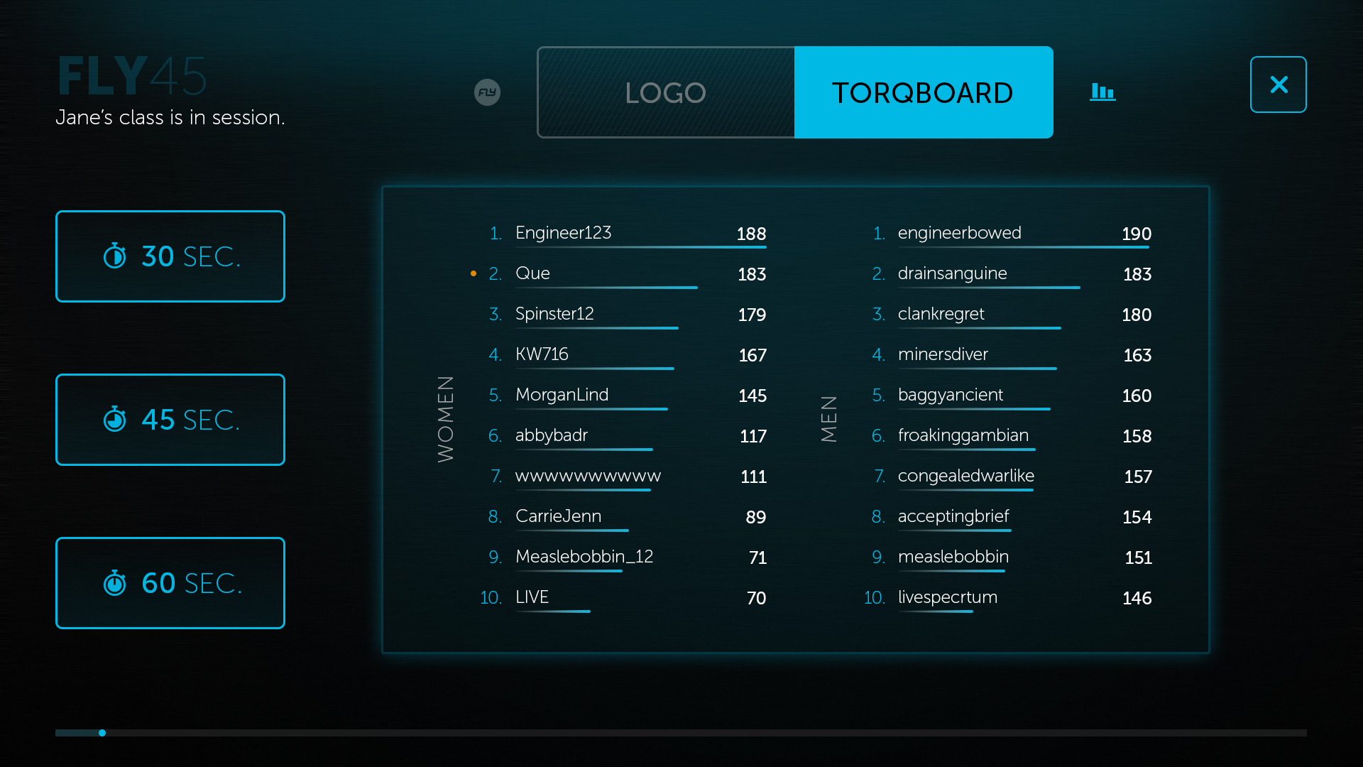
Problem: The controls for the class were confusing and weren’t meeting needs of instructors. Solution: During our research, we found that instructors needed: clearer actions for triggering a race, the ability to clearly toggle between states of the class display, and a deeper sense into the metrics of the class (i.e. the type and a sense of how much time is left). All of which we focused on in the design.
Delightful feature: In a Flywheel class, races are short periods of time (30s, 45s, & 60s) where riders to pedal as fast as they can. It’s the most intense part of the workout. One opportunity we saw for improvement was to amplify this experience. Starting a race changes the color of every display in the class. This both serves as a reminder to riders and intensifies the experience.
Problem: Although a small problem, one thing we heard time and again from instructors is they kept accidentally ending classes. Solution: During our research, we found that the button to end a class was too big. We reduced the size and introduced a confirmation step to assist in preventing accidentally taps.


